Web fonts are becoming more popular, and there are good reasons why. A good choice of fonts can give a site that polished and professional feel. And by giving designers more control over the typography, custom web fonts enable them to keep the feel of the site more consistent with the overall brand.
A Growing Trend
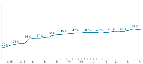
In checking the stats over at HTTP Archive, we can see that the use of custom fonts on websites has climbed from around 20% to over 50% over the past two years. But although they are becoming more prevalent, and can be a wonderful asset in building beautiful sites, they can also have a downside.
Just like other assets—like images, videos, js, etc.—they can help, but they can also have a negative impact on performance if not used appropriately. Today, we’ll review some of the basics of using web fonts, and some general recommendations as they relate to performance.
Web Font Fundamentals
To start, let’s review some basics about web fonts.
Glyphs
Fonts are made of glyphs. What’s a glyph? A glyph is a vector shape that describes a letter or symbol. So, each lowercase letter would be a glyph, each uppercase letter, each number, each symbol, etc. Now, it’s important to remember that the number of glyphs in a font directly relate to the file size of the font files—more glyphs correlate with larger files. For instance, a Unicode font—one that contains a large range of letters, symbols, etc. as well as many languages and scripts—could contain thousands of glyphs, and be magnitudes larger than a font that only contains a specific language or specific subset of characters.
Formats
Not only is a web font is a file that contains the set of glyphs, but the file can be saved in a number of formats. Of course, the various browsers haven’t always agreed about which format to support, so a few formats are typically needed to make sure most web browsers can use the font.
The current formats that are supported consist of: Web Open Font Format (WOFF2, WOFF), TrueType (TTF), and Embedded OpenType (EOT).
- Of these, WOFF2 is currently the best option. Although not all browsers yet support it, it’s built in compression format saves an average or 30% over WOFF, which means it can help with performance when supported..
- When WOFF2 is not available, WOFF is a great fallback, and thankfully, it’s supported by a majority of browsers.
- The other two, TTF and EOT, are for specific browsers that do not support WOFF. TTF is for older Android browsers (< 4.4), and EOT is for older versions of IE (< 9).
- Note: Not that long ago SVG fonts were also being supported by Chrome, Safari, and Android. However, they were never supported by Firefox/IE, and have recently been deprecated in Chrome and Android.
Using Web Fonts
Where To Find
Where do you find web fonts to use? There are two general directions you can go. You can either create and host them yourself. Or, you can use the services of a third party to provide fonts for your website to use. There are both free and paid services available, with Google Fonts and Typekit being two popular options.
If you decide to host your own, FontSquirrel offers a wide number of fonts that you can freely use, or if you have your own (licensed) font that you would like to utilize, you can use their online font generator to create the various formats that you’ll need.
Defining Fonts Using @font-face
Once you have selected the font(s) you are going to use, you will need to to define them in your CSS. If you’re hosting your own, you will need to do this on within your CSS by using the @font-face at-rule (3rd part services will provide you with any CSS, HTML, or JS needed to utilize their services).
Here is an example of the syntax of this rule.
@font-face {
  font-family: 'My Custom Font';
  font-style: normal;
  font-weight: 400;
  src: local('Custom Font'),
       url('/fonts/customfont.woff2') format('woff2'),
       url('/fonts/customfont.woff') format('woff'),
       url('/fonts/customfont.ttf') format('ttf'),
       url('/fonts/customfont.eot') format('eot');
}
In this rule we specify the name of the font, its attributes (style, weight, etc.), and then its source(s).
When it comes to the source, the browser goes through each one in order until it finds one it can use. In this case, it would check locally for ‘Custom Font’ to see if it exists. If not, it would continue to the next option. In the example, it would see if it could use /fonts/customfont.woff2. The format() hint gives the browser an idea of what type of font it is. If it know that this format is compatible, it will try to use it; if it knows it’s not compatible, it will move on.
Since the browser goes in order through the font sources, making sure they are in the proper order is important. It’s in our best interest to make sure we put the newer, better formats first, so they can be used as often as possible. For instance, after the possibility of a local font, WOFF2 is first and will be used by any browser that supports it. Next is WOFF, which will work for a majority of browsers out there. Finally, there TTF for older Android, and EOT for older IE. Not all of these are necessary, especially the last two—it just depends on what browsers you support and how much coverage you want.
Font Variations
Each font family is composed of multiple variations. For instance, regular, bold, italic, etc. If you have a custom font, and want to use multiple variations, you have a couple options.
Manually Defined Variations
To have complete control, you can specify every variation that you want to use. For instance, you could have a @font-face rule for a bold declaration that points to different source files.
    @font-face {
      font-family: 'My Custom Font';
      font-style: normal;
      font-weight: 700;
      src: local('Custom Font Bold'),
           url('/fonts/customfont-bold.woff2') format('woff2'),
           url('/fonts/customfont-bold.woff') format('woff'),
           url('/fonts/customfont-bold.ttf') format('ttf'),
           url('/fonts/customfont-bold.eot') format('eot');
    }
Notice how the ‘font-family’ name is the same, but the font-weight and src files are different.
Now, if we use this font on our page, and set the weight to bold (e.g. 700), the browser will use the font files from this rule. The same thing can be done for multiple weight or style (e.g. italic). The important thing to note, though, is that every variation includes a new font file, and these can add up quickly, potentially affecting the performance of the site.
Synthesized Variations
The other option is to rely on font ‘synthesis’ by the browser. When a browser comes a cross a font in the CSS, it will try to find an exact match. If no match is found, it will substitute the closes match it can find. And if it cannot find the exact style (bold, italic, etc.), it will synthesize it’s own.
Here is an example of how synthesis compares to defining each style individually. The column on the left has each font style defined; the column on the right only has one style defined (400, normal) and relies on browser synthesis for the remaining styles.
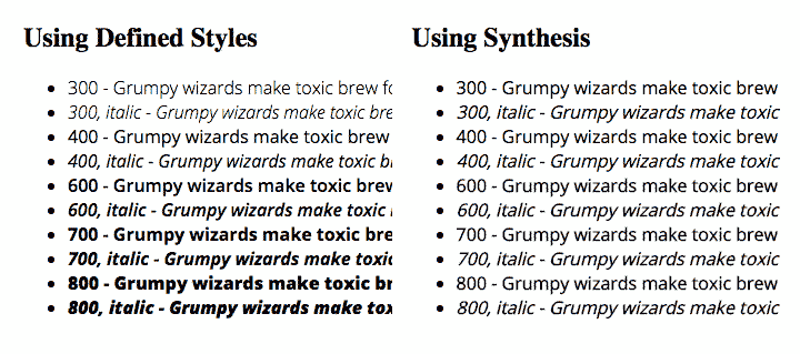
If control and consistency is important, it’s better to specify each variation, since this allow us to retain complete control over the way the text will look. Synthesis, on the other hand, allows the browser to decide how it wants to render each variation, which may or may not be acceptable. In order to not take a performance hit, though, it’s best to first reduce the number a variations to the minimum amount needed so that there isn’t extra overhead.
Using in the CSS
Once your web font is defined in the CSS, you can now use it elsewhere in your CSS. For instance, if I want to use ‘My Custom Font’ on headings in my site, I can now do so by adding it to the ‘font-family’ property. For example:
h1 { font-family:'My Custom Font', sans-serif; }
General Performance Considerations
Using custom fonts can be very appealing, but it’s important to keep an eye on how they are impacting performance. As mentioned earlier, some font files can be extraordinarily large, depending on how many glyphs are included and what format the files are saved as.
Although we’ll go into more detail about performance issues in a future post, here are a few general guidelines to keep in mind:
-
Limit the number of custom fonts you utilize. Although it may be tempting to use several fonts, try to limit the total number. This includes the different variations of each font (bold, italic, etc.) Each font and font style is additional overhead, so it’s important to be selective in what you choose to use.
-
Make sure the fonts you use only have the subset(s) you need. Once you know which fonts you will be using, it’s also smart to make sure the files you use only have the subsets that you actually need. Using fonts that have extra charaters and symbols and languages that you’ll never use only adds additional weight to your page, but offers no tangible benefit.
-
Make use of newer font formats for browsers that support them. Utilizing newer formats, like WOFF2, can help with performance, since these fonts have better compression and smaller size. Also paying attention to the order of the sources in the @font-face declaration can make a difference. If you put older formats first, browsers that support these older formats will use them, and miss out on the size savings that formats like WOFF2 can provide.
Adding custom fonts to a website can enhance the design and feel of the site, and now a majority of the sites on the internet are doing so in one way or another. By using them appropriately and judiciously, not only can we enjoy the benefits of custom fonts, but we can also mitigate the performance hit that they can sometimes bring.